Project Description
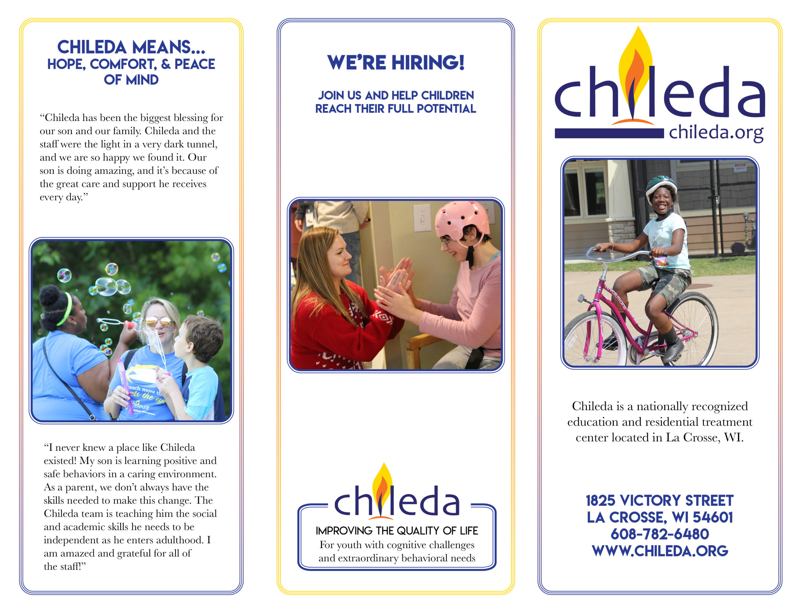
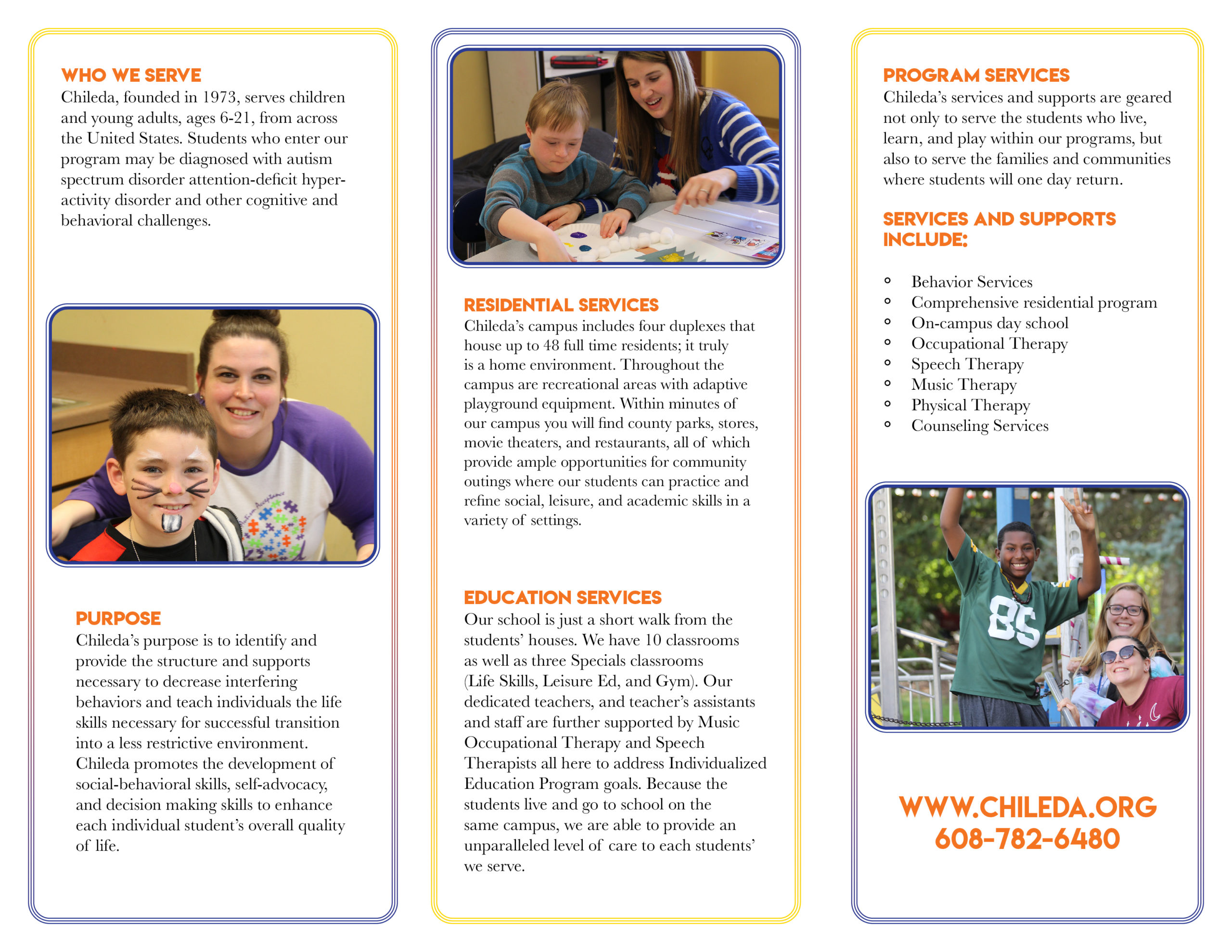
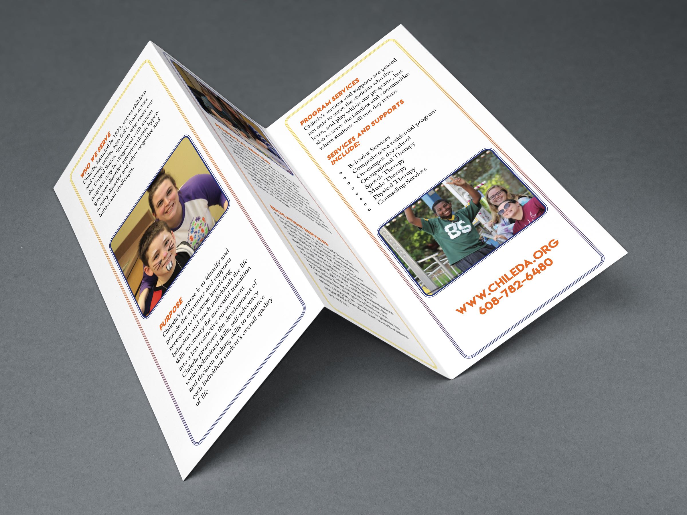
When working with Chileda I was apart of a group creating work such as a logo, flyer's and brochure. I was given the brochure to design up for the client Chileda. As a group we decided to keep the font and colors similar to one another to keep it all cohesive. When I designed the brochure I wanted to keep the design fresh and modern. I think that the look is great and keeping the colors of Chileda seen in a new way.
